Her pointer finger swiftly moves around the touchpad, and then hangs over the left-click button. She has her credit card sitting right beside her Macbook. On the screen, the cursor hangs over the “Confirm” button.
The time is now. The moment of truth.
In ecommerce, there are a few of these “moments of truth” — high consideration zones of your store where visitors make important decisions. These moments of truth are significant. The visitor goes on a journey when browsing:
They could bounce after a few seconds, because nothing captured their attention, or couldn’t find what they’re looking for quickly enough. On average, most sites will see bounce rates of 26% and 70%. They could be browsing to compare prices with another site, find the item they were looking for, and buy within a couple of minutes upon the first arrival. Visitors using search have twice as high a conversion rate.
They could select an item and add it to their cart, only to find it was out of stock. Or, they could select an item, see that there were only five left, and add it to their cart right away. They might have their credit card out on the table, get stumped by the shipping options and dates, and decide to buy later. Or, they could get swayed by the free shipping (a key tactic for retaining holiday buyers).
You can optimize these zones by paying very close attention to the physical proximity of the elements. What’s near your “Add to Cart” button? Why do companies love placing “Free Shipping” messaging near their search bars? Here’s why, when, and how it happens — complete with good, bad, and ugly examples:
1. Consideration: “Hm, What Should I Buy?”
Your visitor has just gotten to the homepage.
Within these zones of consideration, in such an early phase of the process, you’re trying to make the filters as simple as possible. You want to optimize for either discoverability (enabling the customer to discover products — such as in sales, trending, featured sections), or findability (enabling the customer to search for products).
You want to balance this out, especially if people are trying to find things!
Discoverability: Guide the Visitor and Make Sales Clear
At this stage, visitors are at varying stages in their buying process. Some of them might just be browsing. Perhaps they’re curious to discover items — and to see which ones might be on sale or available for a limited time.
As such, your navigation design is of utmost importance. Visitors might be bored, and actually want something to draw their attention. They’re going to decide what type of purchase they want to make.

Free People does a great job directing a visitor’s attention. Their Sale section is highlighted in red in this consideration zone — it’s bold, but it’s not obnoxious.
You can get smart with this sort of personalization. For example, many stores use a tool like Optimizely to target promotional features only to return visitors.

In contrast, have a look at I Want One of Those (IWOOT). Their navigation bar has a similar monochromatic or greyscale color scheme as Free People, but their “Under £20” and “3 For £20” sales don’t stand out.
However, IWOOT chooses to highlight their Free Next Day Delivery in this consideration zone — which makes sense, given that 61% of visitors just browsing would leave before they add to cart because they consider the additional costs too high (e.g., shipping, handling, fees, taxes, etc.).
This type of information, while not necessarily useful at this specific stage in the consumer’s journey, could encourage them to add to their cart to meet the requirements for free next day shipping.
Here’s the tradeoff — if I was just browsing, I’d have to put more effort into looking for the sale section — and even then, I’d have to choose between the “Under £20” section or the “3 For £20” section.

Once the visitor gets into the sale page or category page, they’ll decid what to browse or add to cart. Despite the site’s minimalist feel, Brass Clothing does a good job of conveying important product information in this consideration zone.
At a single glance, a visitor can tell what’s on sale, what the rating is (and how many reviewers contributed to it), and what the price is. This type of information might provoke just enough curiosity for a visitor to click through.
Searchability: If They Know What They Want, Get Out of the Way!
On average, up to 30% of visitors will use your site search box. More importantly, these customers will likely convert at a higher rate, because they know what they want and have higher intent than just a standard visitor. Maybe they’ve already done research, and just need a place to buy. Or, they’re in a rush and need to buy as soon as possible.
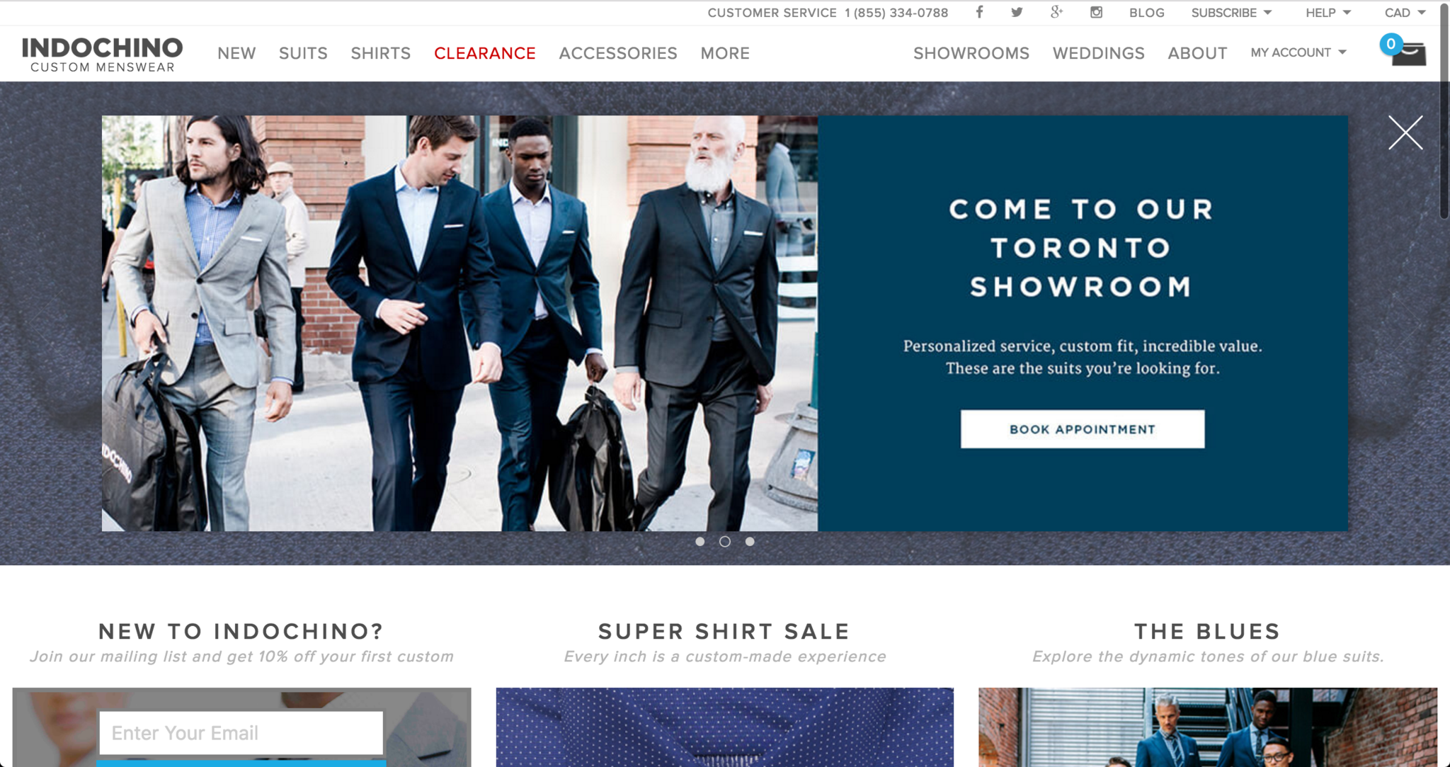
You’ll be surprised how many sites still don’t have search on the home page. For example, Indochino doesn’t. I’m sure it’s a deliberate design decision — their catalog is small and organized enough to be easily browsed through navigation. But I wonder how many visitors they might’ve lost just because they didn’t want to navigate.
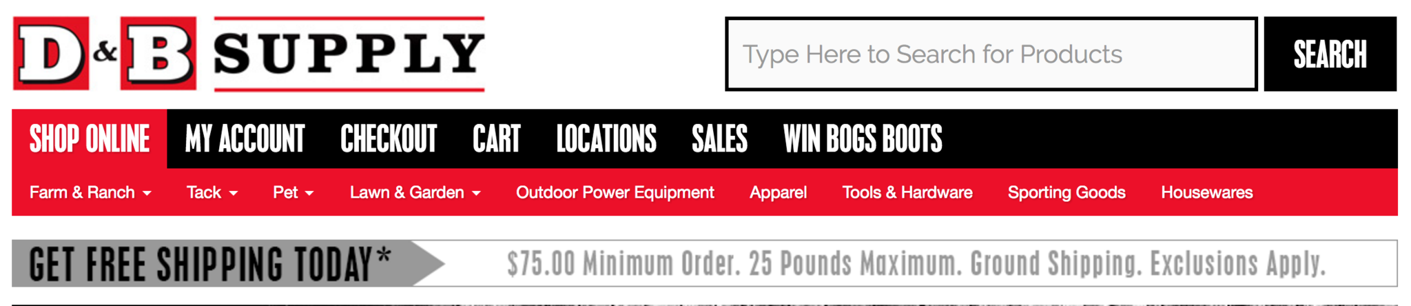
In contrast, D&B Supply has a very obvious search function. It’s great. And, if the eyes wander down just a little bit, they’ll see the free shipping offer (though the cart link is hidden in between other menu items.)
Some sites might also add product images to the search’s drop-down window, which shows suggested search results. Brickhouse Security’s manager of customer acquisition and analytics Ryan Urban, says, “With the product images in the site search drop-down window, we get a 100% lift in conversion rate among shoppers who use site search.”
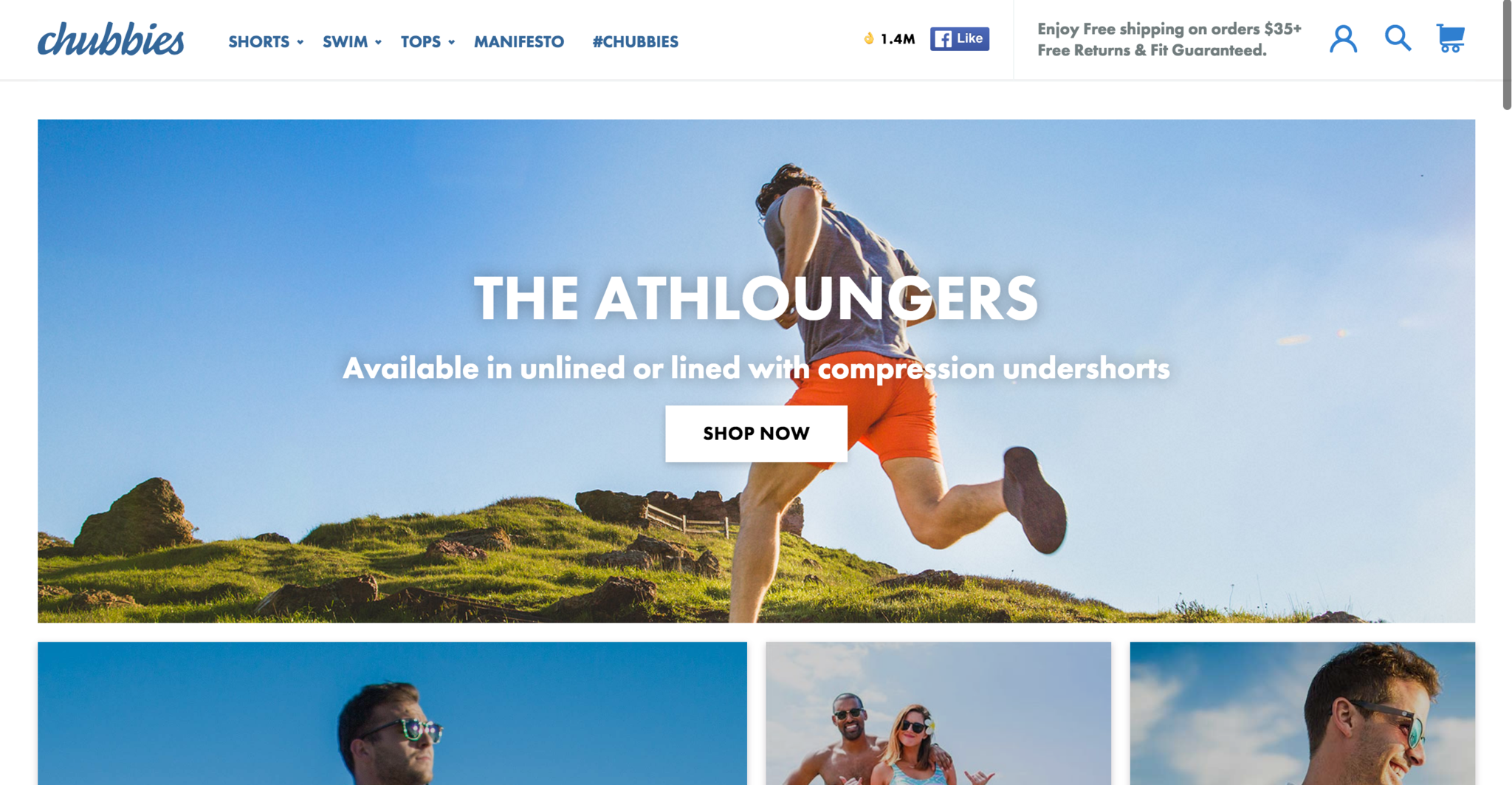
While Chubbies Shorts only uses a magnifying glass icon to highlight their search in the top right, which isn’t the most obvious search bar, it does maximize the high-intent of this area by displaying trending product pictures in search results.
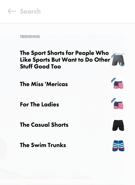
If Chubbies generates a significant amount of revenue from site searchers, making this search bar more visible, and including language about shipping offers could add clarity for these high intent visitors and result in more checkout completions without increasing traffic or spending more on ads.
Okay, so let’s say someone has — either through browsing or search — found the product that they’re interested in. Let’s move to the next few high consideration zones...
2. Product: “Should I Buy It?”
The visitor has now found something they’re curious about, either through the homepage or an advertisement. They want to learn more. Or, maybe they searched your site and found exactly the item they were looking for — and they’re doing some more research before pulling the trigger.
Here’s a situation:
Make Size, Variability, and Availability Obvious
You’re browsing a website — you finally decide you want a certain navy plaid suit — and you go to select your size.
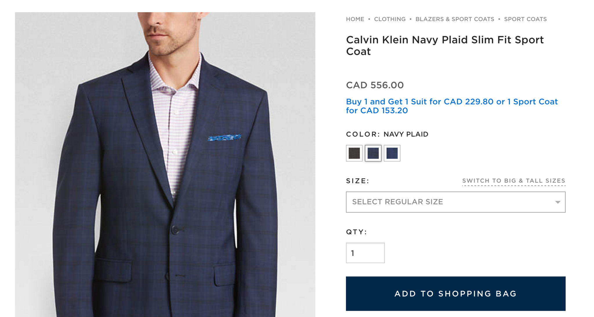
It looks like it’s available ...
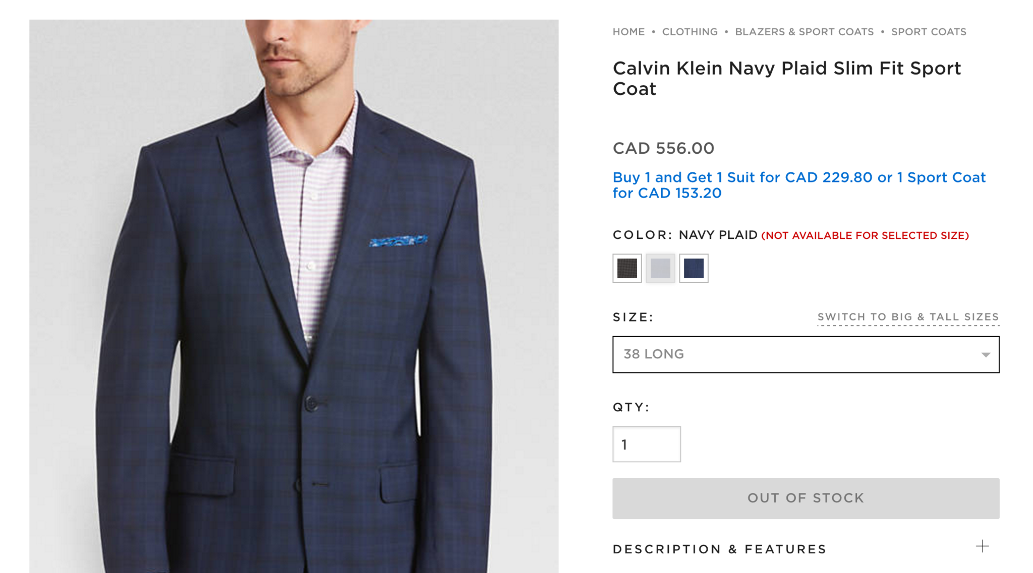
Agh! Maybe not. How frustrating.
There’s a missed opportunity. Not only did Men’s Wearhouse just frustrate and repel their customer in that high consideration zone, they didn’t even get their information for next time.
They could update the dropdown menu with inventory (e.g., “38 Long (Out of Stock — Get on Waitlist)”, which, when selected, would lead to a mailing list signup, or “38 Long (Only 2 left!)” which would increase urgency. It’s simple, it’d be much less frustrating for the visitor, and it’d create an opportunity to compel a current or future sale.
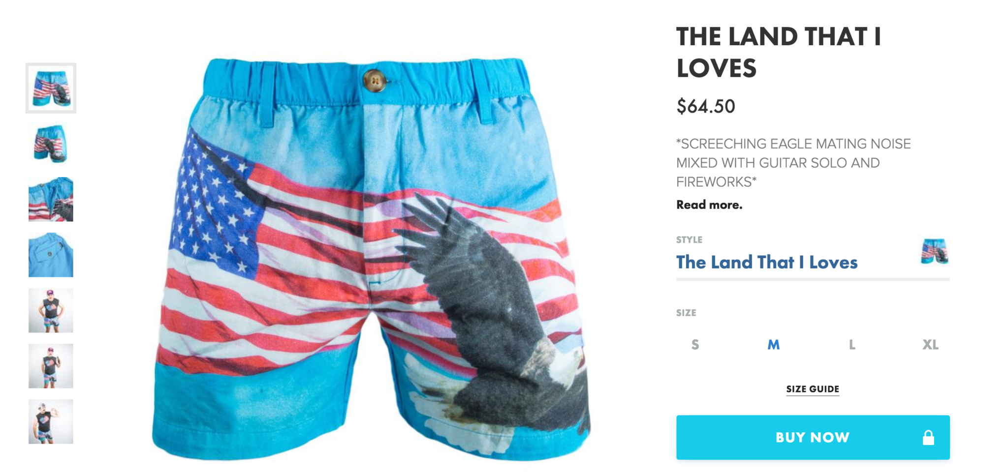
In contrast, look at how Chubbies displays the sizes on the product page...
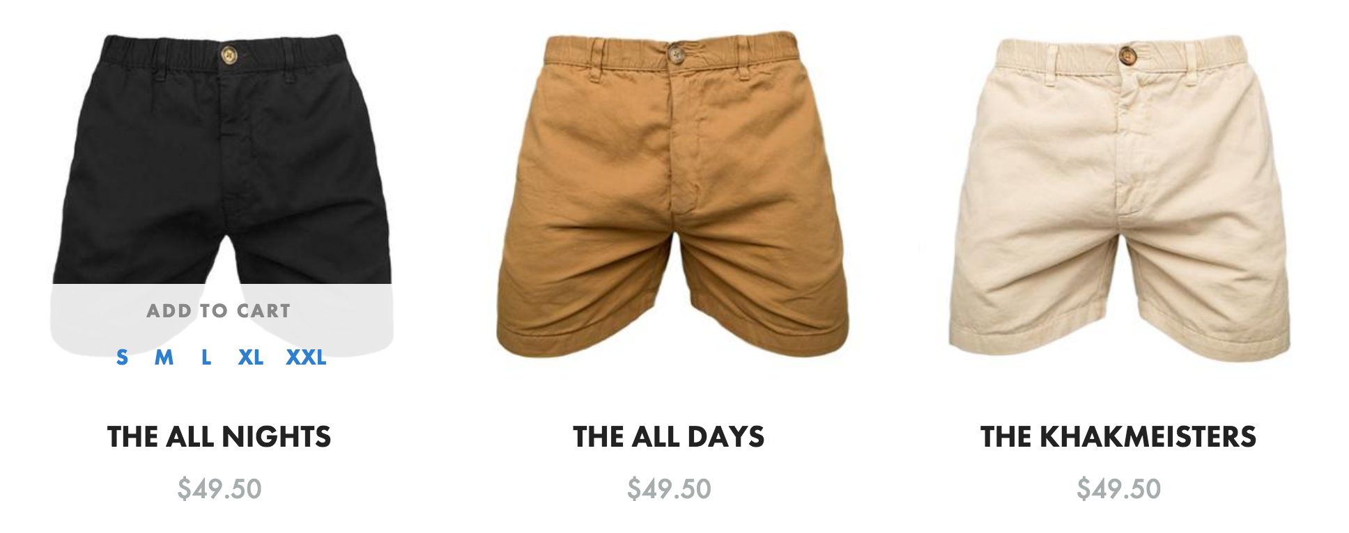
And even when the cursor hovers over an image on the general category page. The visitor knows what to expect. There is minimal frustration.
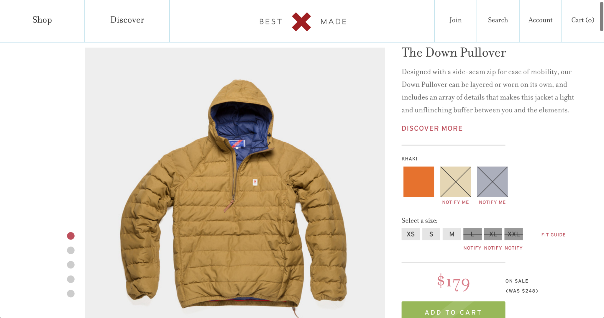
Similarly, Best Made displays their variability and sizing forms in a way where visitors can know right away if their preferred color and size are available.
But best of all, there are the numerous Notify buttons…
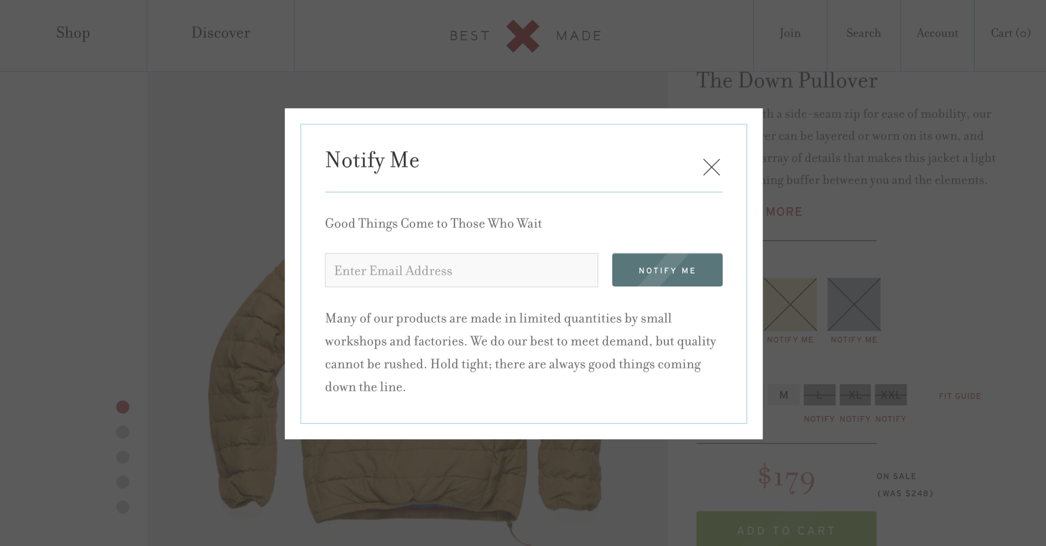
It’s simple and brilliant. Each button leads to a different segmented list, which makes it easy for Best Made to reach out directly by email when the variation or sizing is back in stock. Chubbies might not have capitalized on this particular sale, but it still does what it can with this moment of truth and high consideration zone.
Even if you’re out of stock, your visitor probably has a pretty a high buying temperature — make sure you seize the opportunity to get them to come back.
Microcopy: Subliminal Reassurances and Encouragement
Microcopy is a word to describe an incredibly powerful technique. If copy consists of words that people will read to persuade them to think or do something, microcopy consists of words that most people won’t read — but still influences them in a major way.
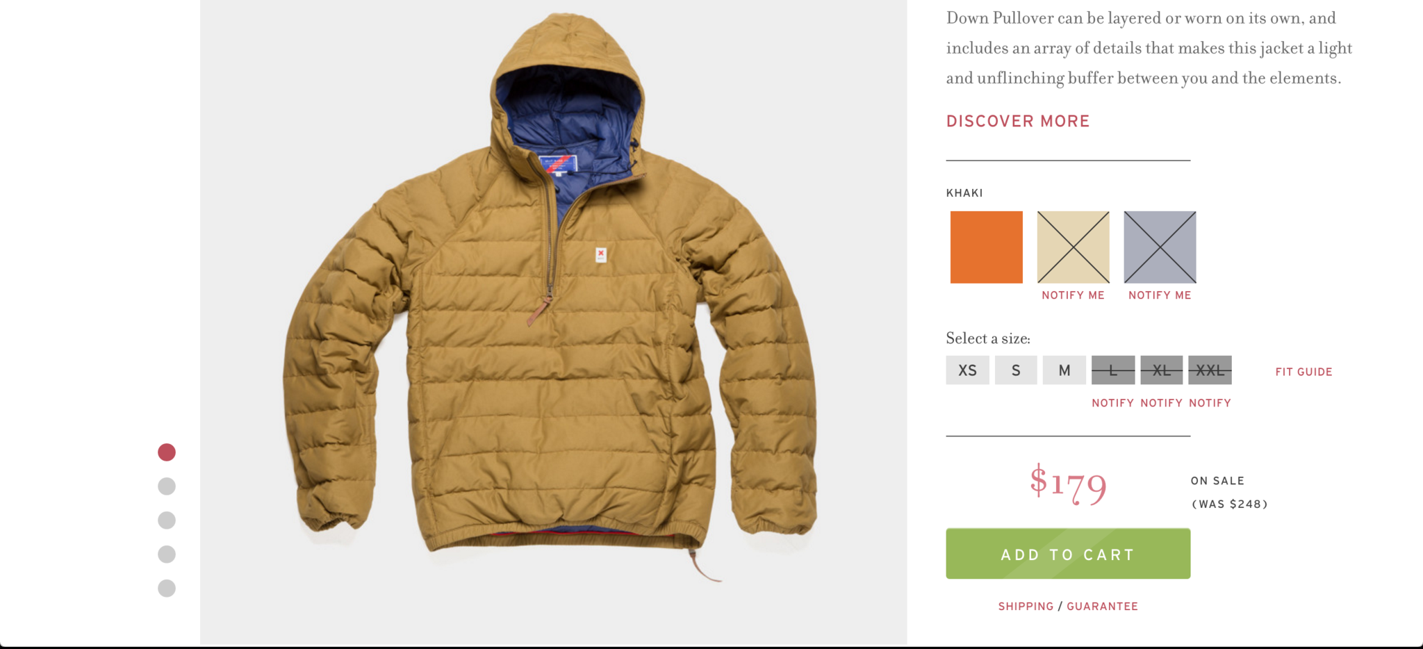
In case someone is thinking about “Add to Cart” on Best Made, but is a little reluctant, their eyes will naturally drift to the word, “Guarantee.” If they were hesitant about shipping, they are one click away from learning more about shipping and guarantee policies. Best Made also reminds the customer of the sale price and reiterates the original price — both right near the “Add to Cart” button.
Placing a link to the “Fit Guide” right next to the sizing is good, in case people are confused about which size they might be.
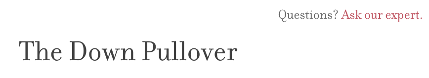
Right above their title, tucked away in the corner, there’s the “Ask our expert” button. I actually think this is a great idea — the customer is already browsing the product, so there’s no reason to make this button huge — it’ll encourage them to click away.
But, if the person is hesitant and on the verge of giving up, and hovering up to close the window, they’ll see this link in the top right corner. And maybe, just maybe, they might consider asking an expert.
Variation: Simplify When You Can
Most products don’t vary too greatly. Visitors can typically choose amongst different types of colors or patterns. At most, maybe they can alter the design, or customize certain modules.
Naturally, some products are a bit more complicated.
For example, going into an electronics store in the 90s and learning about what GHz meant, what Ram was for, and what the differences between Intel and AMD processors were.
Technology is not as straightforward as clothes. Let’s say you wanted to buy a hidden camera. (I won’t ask.)
But, what would you do if you saw this when you clicked “Compare Camscura Models”?
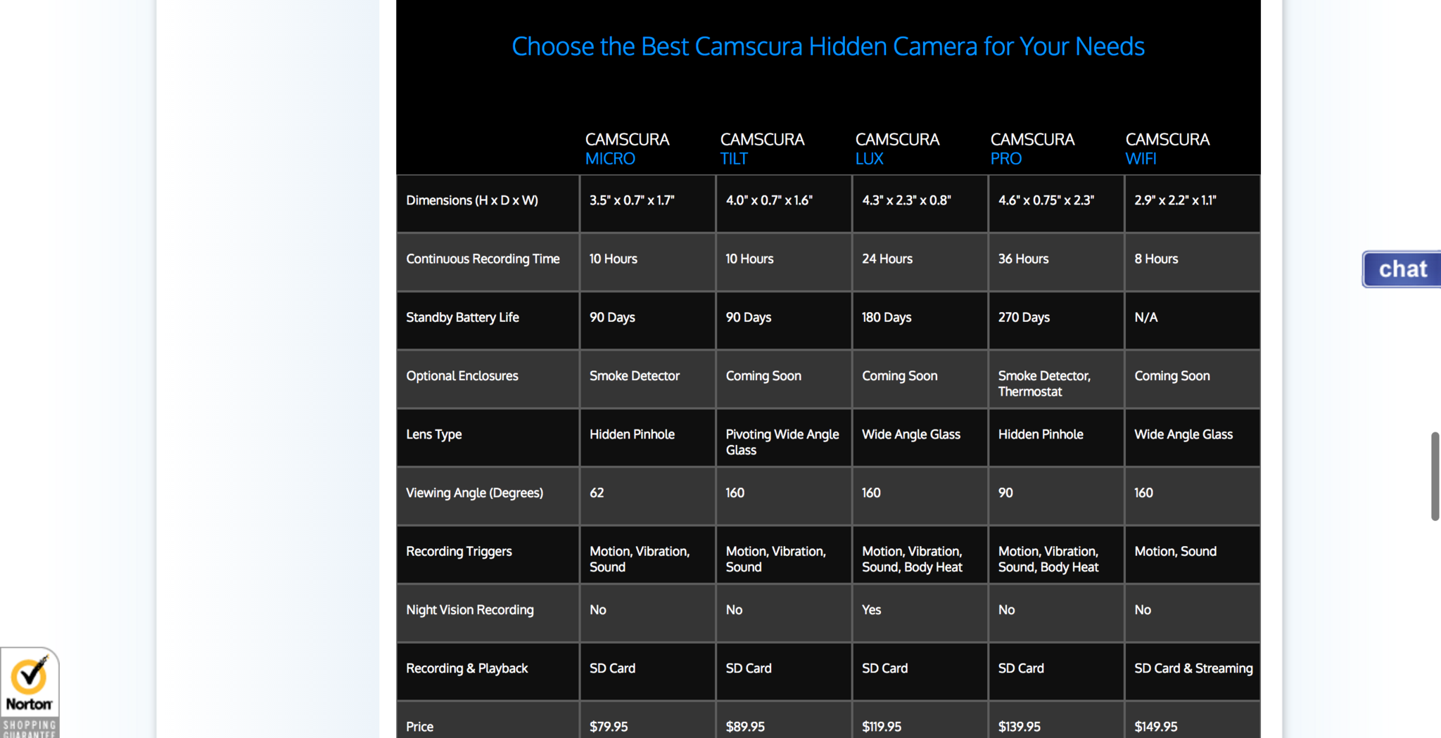
At a glance, this page screams analysis paralysis for the average visitor. Even if I were hellbent on getting a security camera, I would — at most — call into their support line to get someone to explain all this stuff to me.
While certain options are clear, there are other ones that aren’t as apparent. For example, what’s the viewing angle I would need for my use case? Do I need a body heat recording trigger? Is the Wi-Fi worth it — and is it reliable?
Anyone interested enough in this is probably curious enough to buy something (or at least try it). So it’s best to encourage them at this stage. Even just thinking off the top of my head:
- It could be more visual.
- It could have default options for certain situations or circumstances (e.g., “Great for the office!” or “Recommended for travel.”).
- There could even be a best value suggestion, or one for high-intensity recon, and so on.
Look, I’m not saying that there shouldn’t be a comparison chart. Of course, there should be — it’s helpful for the more expert shoppers. However, if even a portion of your shoppers aren’t experts, you’re going to be scaring them off when you could’ve been encouraging them to “Add to Cart” in that consideration zone.
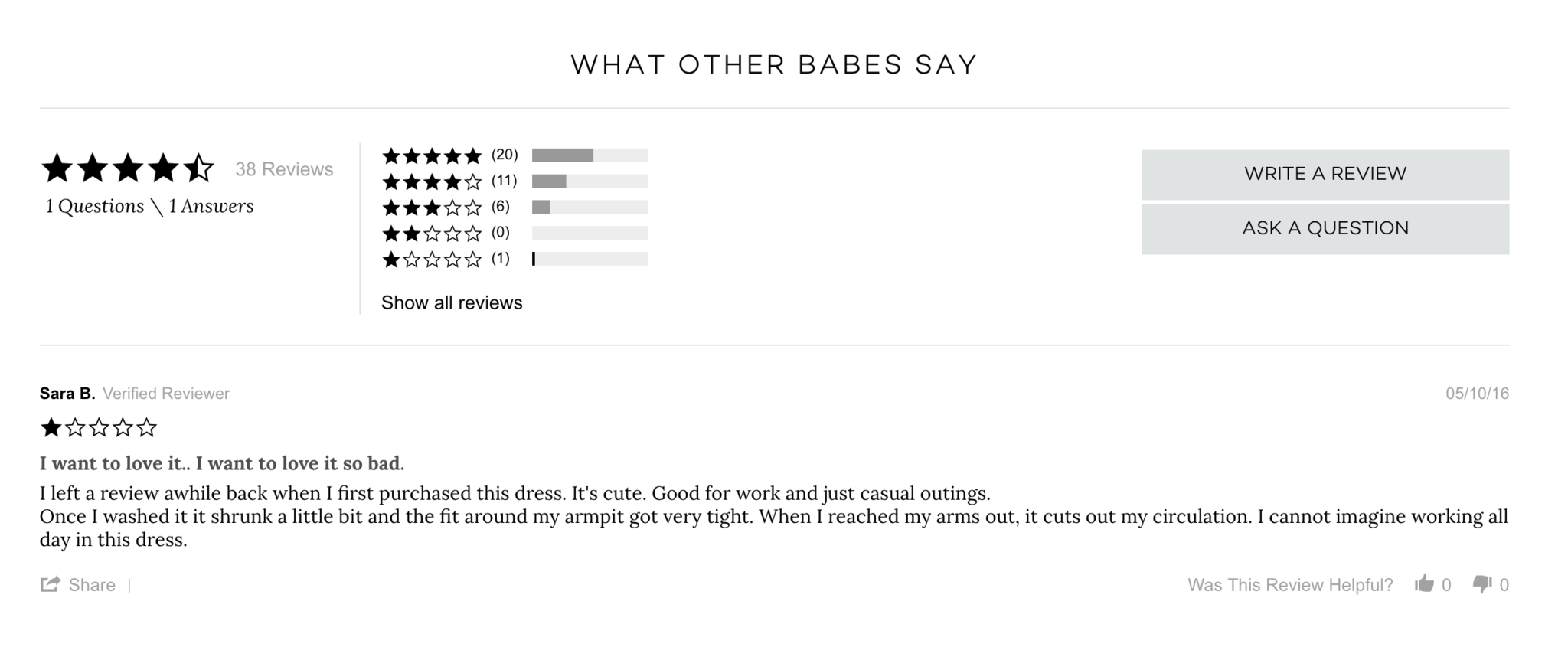
Customer Reviews: A Little Negativity Goes A Long Way
Authentic customer reviews are very important. They can tip the scales in favor of a product (or break the deal).
Contrary to what you might think, a couple of poor customer reviews actually lead to increased conversions (by 67%). That’s because having a few poor reviews make the good reviews look more trustworthy and believable.
In order for you to accommodate this consumer behavior, you must make sure that your reviews are easy to find in the consideration zones on the product page.
Brass Clothing’s stars are displayed above the price and under the product name. It’s close enough to the “Add to Cart” button and sizing chart to see in a quick glance and offer the social proof that could tip the scales — in case the visitor was having second thoughts about clicking.
Better yet, it has a very comprehensive — and balanced — review section.
Add to Cart: Make It Obvious and Provide the Next Step
The visitor decides they like what they see, and moves to add the product to their cart. My colleague Ott Niggulis will go deep into how to do “Add to Cart” well in a few weeks, but I’m going to show you some quick examples:
A good “Add to Cart” deserves attention. And that sounds simple enough...
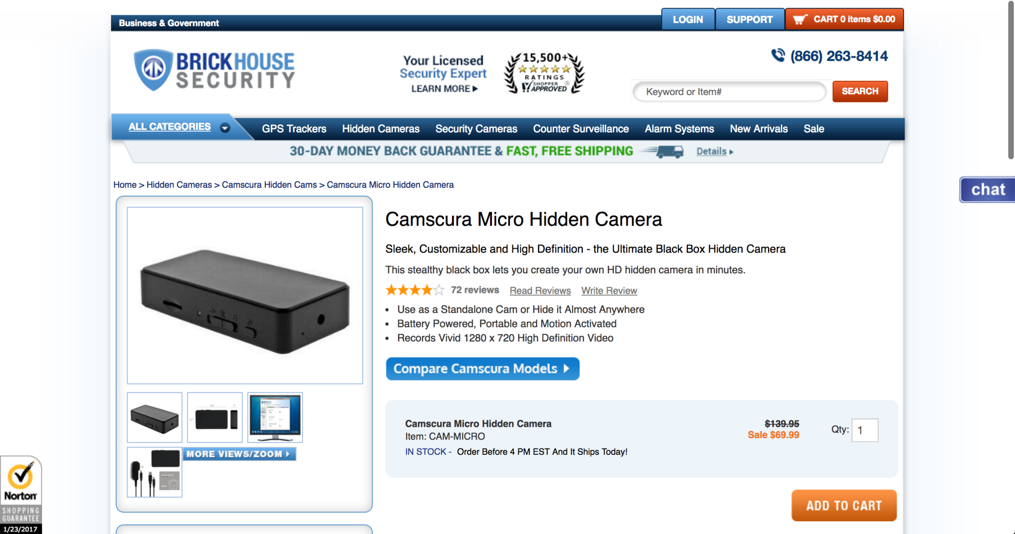
BrickHouse Security has a bright orange “Add to Cart” page — in the middle of nowhere. It’s “Compare” button hogs the attention because it’s much closer to the product photos, reviews, and product descriptions. Worse yet, there are no attention-grabbing elements even close to the “Add to Cart” zone.
On a more positive note, Brick House’s search bar and phone number are tied in well together at the top. It would make sense to switch the locations of the “Compare” and “Add to Cart” buttons. Brick House also displays social proof with the badge placed right near the search bar — a particularly important message given the nature of security products.
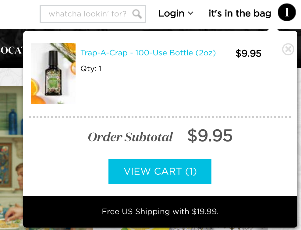
Feedback after the “Add to Cart” button is also important. For example, Poo-Pourri updates the number with a number of products a visitor adds.
But the magic happens when a visitor clicks the number. They’ll quickly see the Order Subtotal. But best of all…
The free shipping threshold (Free US Shipping with $19.99) is very clear, right below the “View Cart” Button.
Upon a glance of that, a significant portion of people will see the free shipping message, say to themselves, "What's another $10 to get free shipping?" and find another $10 item to push the cart total over.
Here’s the really genius part. Each of Poo-Pourri’s 100-Use Bottles (2oz) are $9.95. If a visitor wanted to hit the free shipping threshold ($19.99), they’d naturally add another bottle. Unfortunately, that math only adds up to $19.90. They fall just short of free shipping.
Because there are no items for $0.10, the visitor’s original intent of buying one item means they have to now buy a third or a second item that is over $10.05.
This would be the 200-Use Bottle (4oz), which is $14.95.
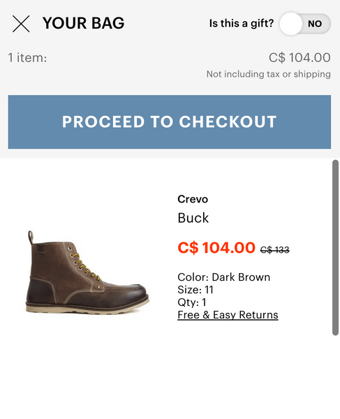
Similarly, Jackthreads also pops a window up in the corner of the screen after the visitor clicks “Add to Cart,” but takes it to another level with their consideration zones.
Right above the “Proceed to Checkout” button, there is the price, which also plants the idea that shipping and tax isn' included. This means the visitor won’t be unpleasantly surprised with unexpected costs (which, as mentioned earlier, is the reason most visitors abandon carts) when they get to the checkout.
Looking underneath the big “Proceed to Checkout” button, you’ll see all of the most relevant product information, how much you're saving, and “Free & Easy Returns.” These messages calm the visitor’s inner doubt, which would likely ask something like, "What if I'm ordering the wrong size, or don't like the color when I get it?"
The "Is this a gift?" button is right above that section. If switched to “Yes,” this happens:
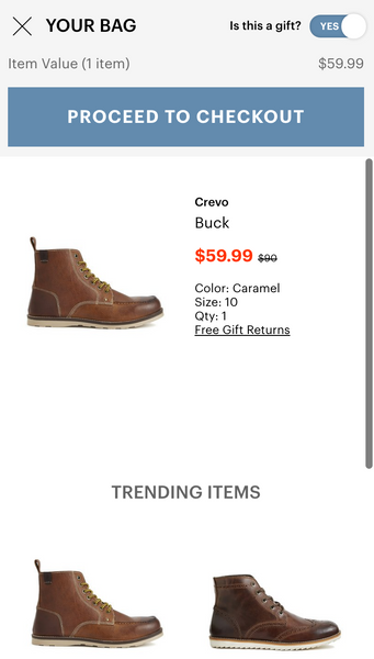
The microcopy changes from “Free & Easy Returns” to “Free Gift Returns,” and JackThreads displays a Trending Items section. And it’s surprisingly easy to shop for these items within that box.
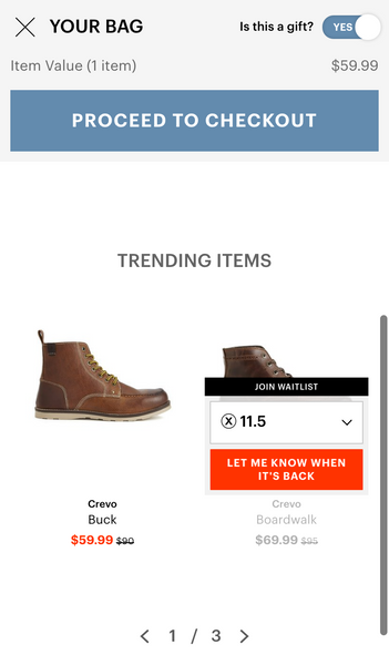
This type of flow is almost exactly what I was suggesting for the Men’s Wearhouse example. And obviously, if sizing is available, the call-to-action changes from “Let me know when it’s back” to “Try it for free.”
From that point, the visitor makes a decision — are they ready to wrap this up, or do they want to keep browsing?
3. Purchase: “Am I Sure?”
This is it — arguably the most important moment of truth. The visitor has added all the items they wanted to, and they’re ready to check out. Don’t get your hopes up — most of them won’t. On average, abandoned cart rates are at 79%, according to Listrak.
Checkout Button: They’re Feeling Ready
Even if your visitor didn’t want to check out after adding something to cart, they might decide that they want to check out as they’re browsing. Make it obvious how they can do that, and make sure they can’t forget that they have something in their cart.
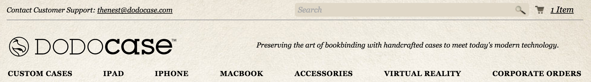
Dodocase has a small cart icon and item link in the top right, close to the search bar. But it doesn’t stand out. There is no color contrast between the cart and the search bar colors. The visitor can easily overlook this.
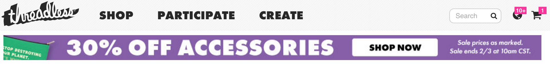
Conversely, have a look at Threadless’s cart. When an item is in the cart, Threadless displays a loud pink — a very different color from the rest of its website and navigation.
Even better, it’s right beside two frequented navigation elements. One is the search bar, and the other is a notifications menu which displays updated prints, products that are about to run out of stock, and Threadless contest updates.
It’ll be difficult for a visitor on the Threadless site to forget about their cart.
Checkout Form: Reduce Fears and Uncertainty
Online marketer Bryan Eisenberg writes about the three most common form problems:
- Forms that fail to reduce fear
- Forms that fail to build trust and credibility
- Forms that fail to reinforce benefits
I’ll go in-depth into this a couple of weeks from now, but here are some examples of ecommerce companies that address these common form problems well.
For example, the main reason people end the buying process early is because of unexpected costs. That’s why highlight shipping, handling, and other fees is essential:
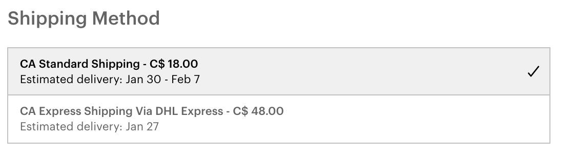
JackThreads has a pretty standard shipping process, and it does a good job getting the fundamentals right. It specifies the delivery service, which borrows that company’s credibility (e.g., DHL Express). It reassures the customer in this consideration zone.
In shipping methods, it outlines both the estimated delivery dates, and how much each shipping selection costs. The benefits to each shipping option are very clear — you know you’ll pay $30 to get your products three days faster.
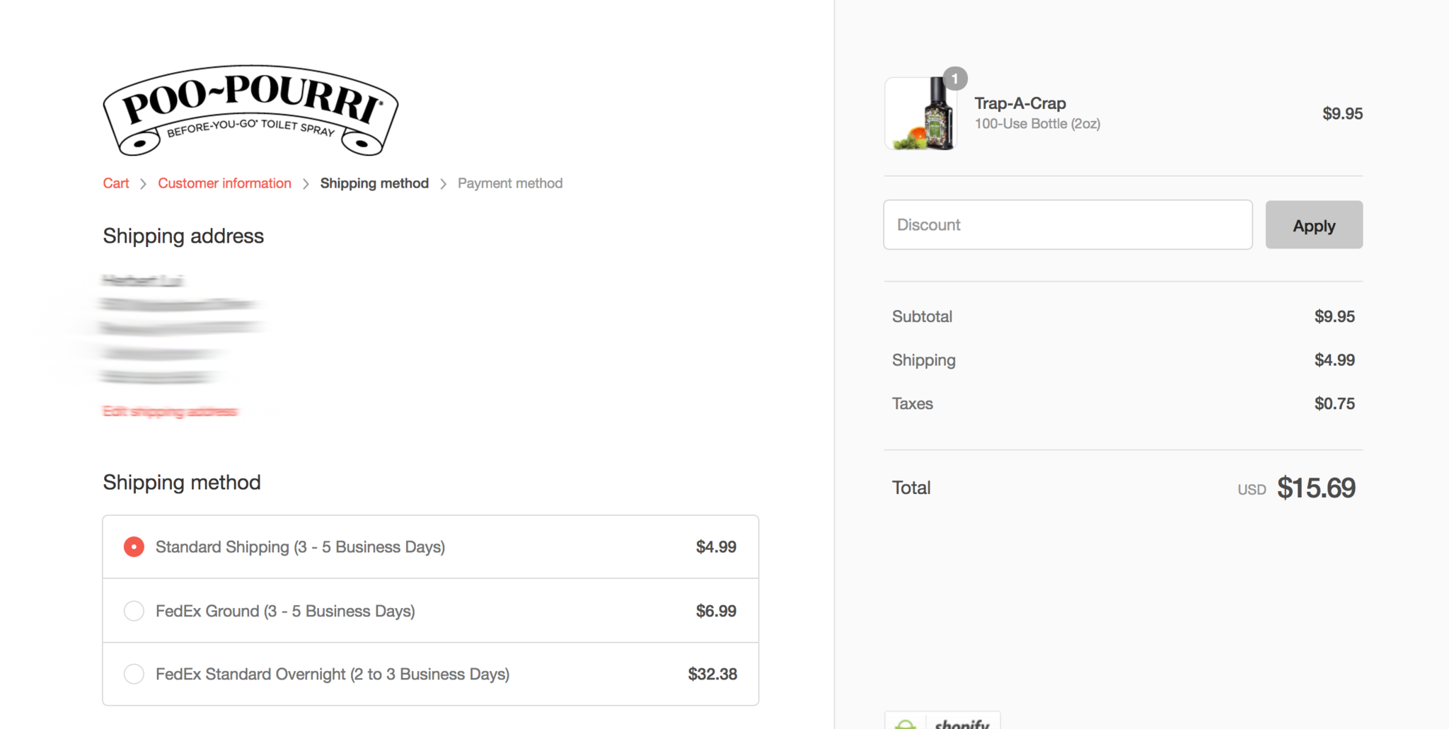
Poo-Pourri does an excellent job highlighting shipping details and pricing as well. And again, this sounds simple, but…
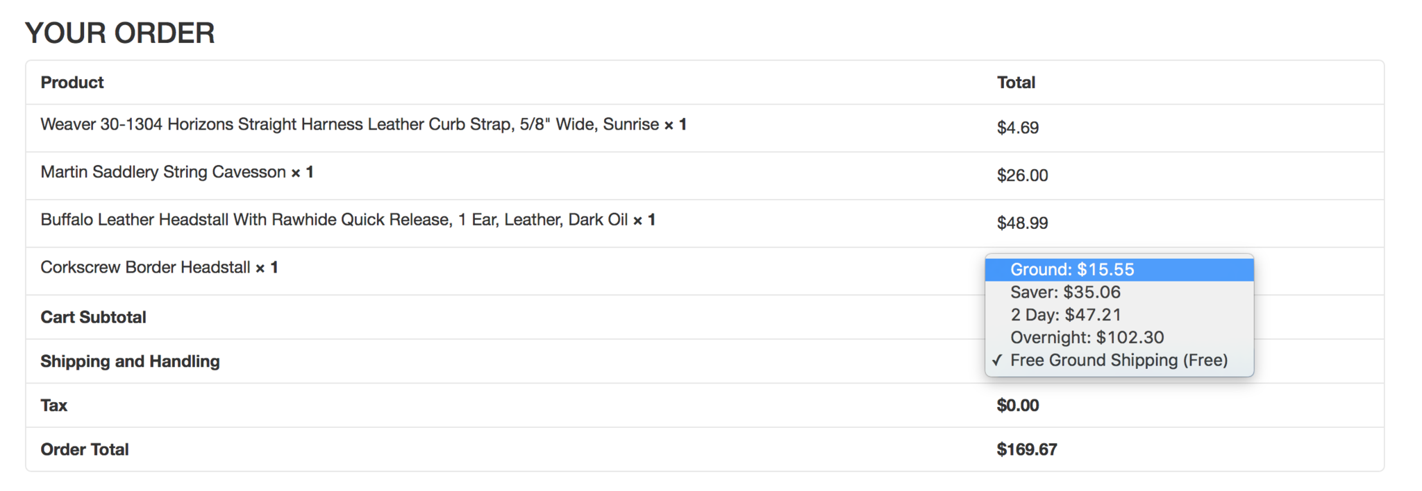
While D&B Supply does an ok job of building trust by summarizing everything, it doesn’t show the estimated time and date for Ground and Saver shipping options. Everything is a bit less certain.
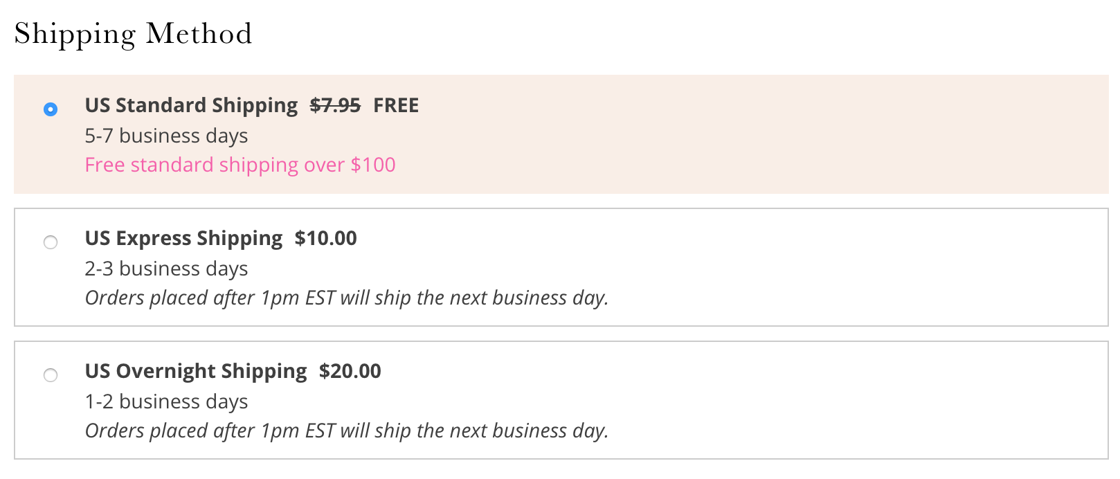
Now, look at this. Free People illustrates when the products will be shipped, and how long that might take. Some people might prefer to see a range of dates, but this will do.
Free People has a great anticipatory form that fills in various fields for shipping information. This is a very good idea, given that it’s in their best interest to make this process as frictionless for visitors as possible.
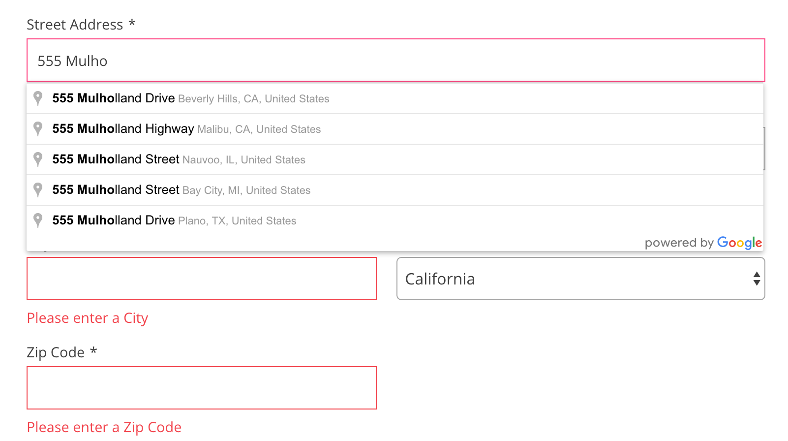
According to the Baymard Institute, 27% of US online shoppers have abandoned an order in the preceding quarter because the checkout process was “too long/complicated.” Any time and effort you can save your visitor will make it likelier they check out. Unfortunately …
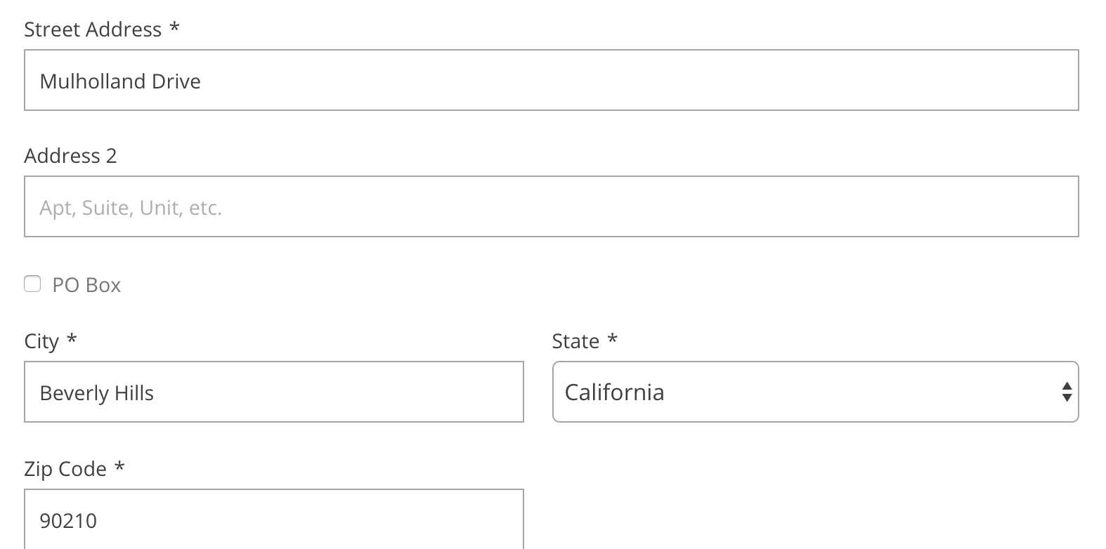
Despite filling in the City, State, and Zip Code fields accurately, for some reason Google Maps didn’t write in the numerical address (“555 Mulholland Drive”).
With that said, I actually only experienced this bug with the “555 Mulholland Drive address.” I tried a few other addresses, and they all worked, so maybe it was a one-off. Either way, I like the spirit behind this, but the execution and implementation has to be near perfect. Someone in a rush might not double check to see that the address was implemented correctly, and even if they do — they’d have to double back if they catch it in their confirmation page.
We plan to dive deeper into autofill and anticipatory forms shortly. Keep your eyes peeled for it!
Final Thoughts
Even though the fundamentals of these consideration zones are simple and straightforward enough, many of the best retailers overlook these little details that can produce huge improvements to your website.
If you want to get serious about it, you can calculate each how each consideration zone correlates with your conversion rate.
In coming weeks, we’ll show a number of other methods — each more sophisticated and exciting — to improve your website. You won’t want to miss it.
Read More
- What Your Visitors are Thinking Right Before They Click “Add to Cart"
- Instagram Ecommerce, Apps & Business Accounts: Are You Ready for the Coming Changes? (Here’s How to Make Sure)
- Reimagining Racial Equity in the Fashion Industry
- Back-to-School Marketing: Ideas, Stats & How to Automate the “Other” Black Friday
- Multi-Channel Marketing: Definition, Data, and a Strategy to Sell Anywhere
- 14 Video Ads That Blew Our Minds In 2015
- How I Raised $1.1 Million Without a Network or Experience
- Multichannel Inventory Management: Problems & Solutions